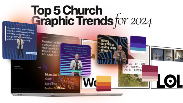
Have you ever wondered how church graphic design can transform your congregation’s engagement? In 2024, churches are embracing new design trends to foster deeper connections and enhance communication. As visual media becomes increasingly vital, staying updated with the latest design shifts isn’t just an option—it’s essential. Expect a mix of vibrant color palettes, minimalist approaches, and interactive designs capturing hearts and minds.
Embracing Minimalism
Minimalism in church graphic design is making waves in 2024. This trend is all about clean lines, ample white space, and simplicity. It strips away the unnecessary, leaving only the essentials.
Benefits of Minimalism in Design
- Focus on the Message: Minimalism helps keep the focus where it should be—on the message. By reducing distractions, the core message becomes more impactful and easier to understand.
- Enhances Readability: A minimalist design allows for better readability. With fewer elements competing for attention, texts become easier to read and digest.
- More Professional Look: A clean and simple design looks more polished and professional. It’s like dressing your Sunday best; it leaves a good impression.
- Versatile Across Platforms: Whether it’s a church bulletin, a website, or social media, minimalism works everywhere.
Bold Typography Choices in Church Graphic Design
In recent years, bold typography has emerged as a dramatic element in church graphic design, offering more than just readability. Words have power, and when they stand out with boldness, they can capture attention and convey messages effectively.
Combining Fonts for Effect
- Mix Serif with Sans-Serif: This classic pairing offers a balance between traditional and modern looks. A serif font for headlines paired with a sans-serif body text can create a striking contrast.
- Play with Weights and Sizes: Using varied weights within the same font family can add depth to the design.
- Limit to Two or Three Fonts: Too many fonts can clutter the design and confuse the viewer.
Vibrant Color Palettes
Colors have the power to capture attention and invoke emotions, making them an essential tool for creating impactful church visuals. This year is all about using striking and contrasting colors to tell a story and to connect on a deeper level with viewers.
Color Psychology in Design
- Red: Perfect for highlighting important messages or events, like a call to help or urgent announcements.
- Blue: Often associated with peace and faith, making it a great choice for newsletters and backgrounds.
- Green: Represents growth and renewal, ideal for promoting new initiatives or ecological projects.
- Yellow: Bright and uplifting, great for drawing attention to joyful events or services.
Integration of Technology
In recent years, technology has reshaped nearly every aspect of our lives, and church graphic design is no exception. The church is embracing this shift with open arms, using digital tools to engage congregations in fresh and exciting ways.
Augmented Reality Experiences
Imagine looking at a church bulletin and seeing it come to life with animations and interactive elements. This is the beauty of augmented reality (AR) in church graphic design. AR can transform ordinary church materials into dynamic, interactive experiences that captivate both young and old audiences.
Embracing the Trends
Exploring the top church graphic design trends of 2024 reveals a fresh approach to engaging communities. From vibrant color palettes to interactive multimedia elements, these trends highlight the power of visual storytelling in conveying uplifting messages.
Adopting these innovative design techniques is a surefire way to boost congregation interaction and engagement. As we move forward, consider how these trends can be part of your church’s outreach and community-building efforts.